How to Create Interactive Maps
Intro
As mentioned in the first post in this series, a good way to distinguish your visualization is to add a level of interaction for the user. In this series, we explore using a Parameter to dynamically highlight items in our visualization. In the last post, we looked at how to use parameters to dynamically color bar graphs in your visualization. In this tutorial, we will look how we can use the same Parameter feature to create an interactive map that colors areas that are above and below a Profit threshold that the user can change dynamically.
Instructions
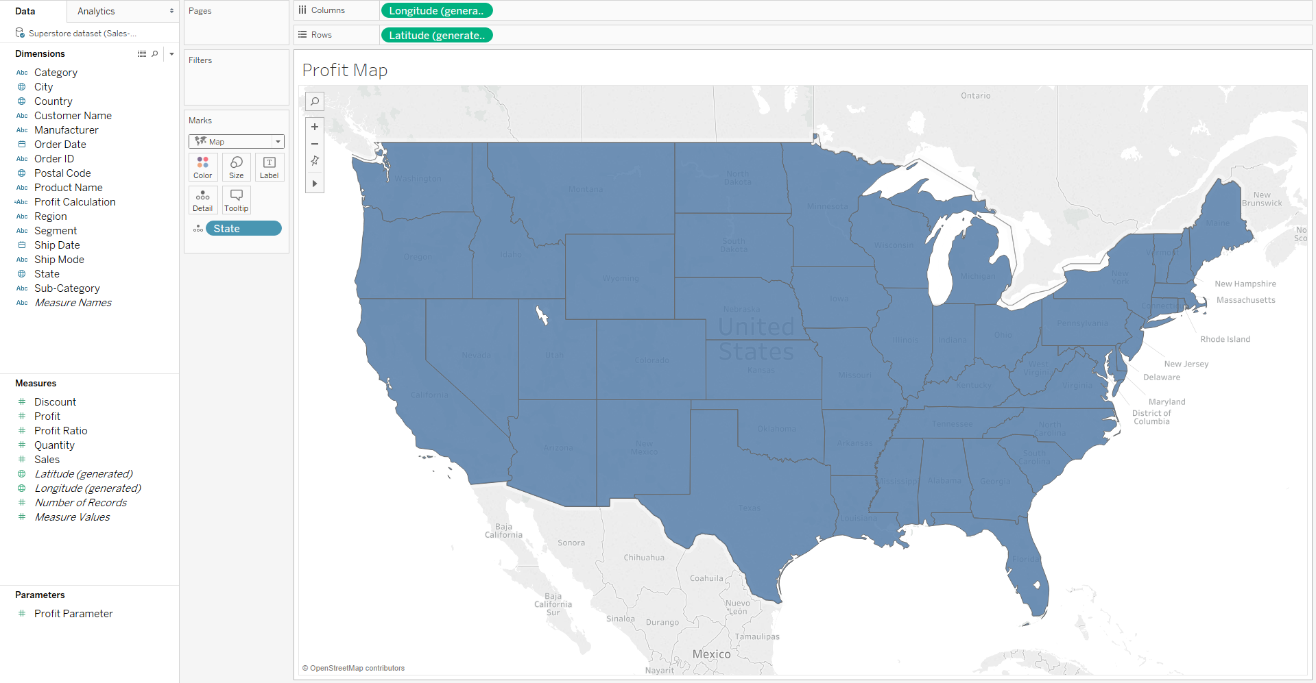
- First, we will create a map of the US, by dragging the State dimension and dropping into the worksheet. Then in order to make the map filled, we select the “Map” option from the dropdown menu in the Marks section.
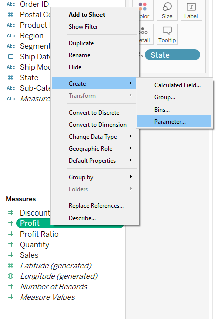
- We will now create a Parameter using the Profit Measure which will set our profit threshold level for each state.
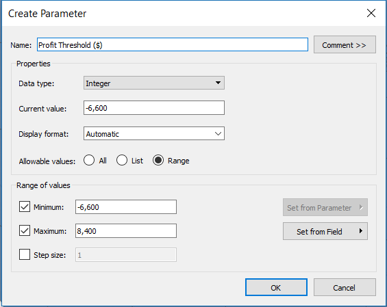
- Name the Parameter something that will be intuitive to the user, such as “Profit Threshold”.
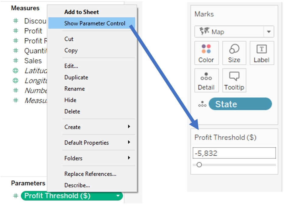
- This will create a new section “Parameters” with your Profit Threshold Parameter inside. At this point, the parameter is not responsible for any changes in the visualization and is not visible to the user. Let’s change that by clicking “Show Parameter Control”.
- Now we want to create a Calculated Field that is able to tell whether the profit for each state in the map is below or above the value that is selected in the “Profit Threshold ($)” Parameter. Right click your Parameter and click “Create Calculated Field...”.
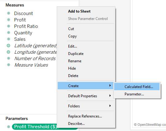
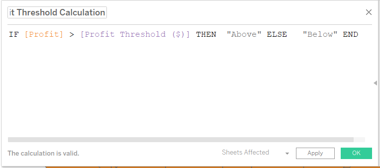
- Name your Calculated Field something that is intuitive to the user, and copy and paste the following code into the body of the Calculated Field:
- IF [Profit] > [Profit Threshold ($)] THEN "Above" ELSE "Below" END
- This is a simple if-then statement that checks to see if the profit for each state shown in the sheet is greater than the value currently selected in our parameter. Every state for which this is true gets grouped into a group called “Above”, and the rest get grouped into a group called “Below”.
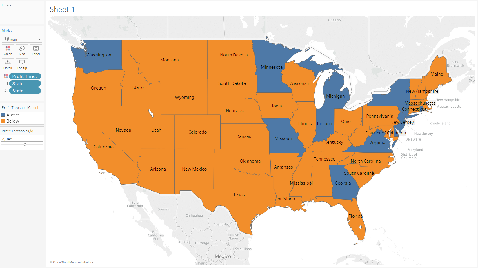
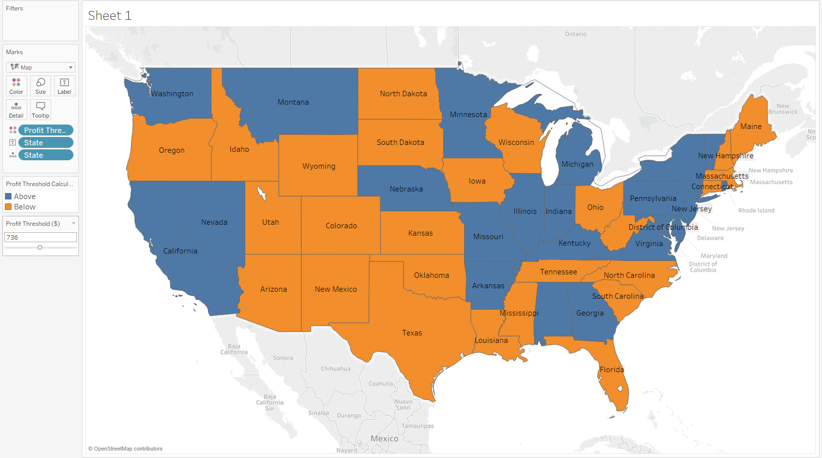
- The last step is to drop your Calculation onto the Color Tab in the Marks field, and you’re done! Now, depending on the value that you choose in the Parameter Control, you will get a differently colored map that will reflect which states' profits are greater or lesser than the Profit Threshold ($).
Author: Maksym Monastyrskyy